UI/UX Designer with a sharp eye for visual design and product thinking.
I turn complex requirements into clear, thoughtful digital experiences — combining UX thinking, strong visual craft and hands-on collaboration from idea to implementation.
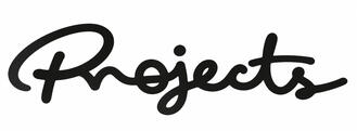
Adligo CRM
Rethinking a cloud-based management platform — from brand identity to core product experiences.
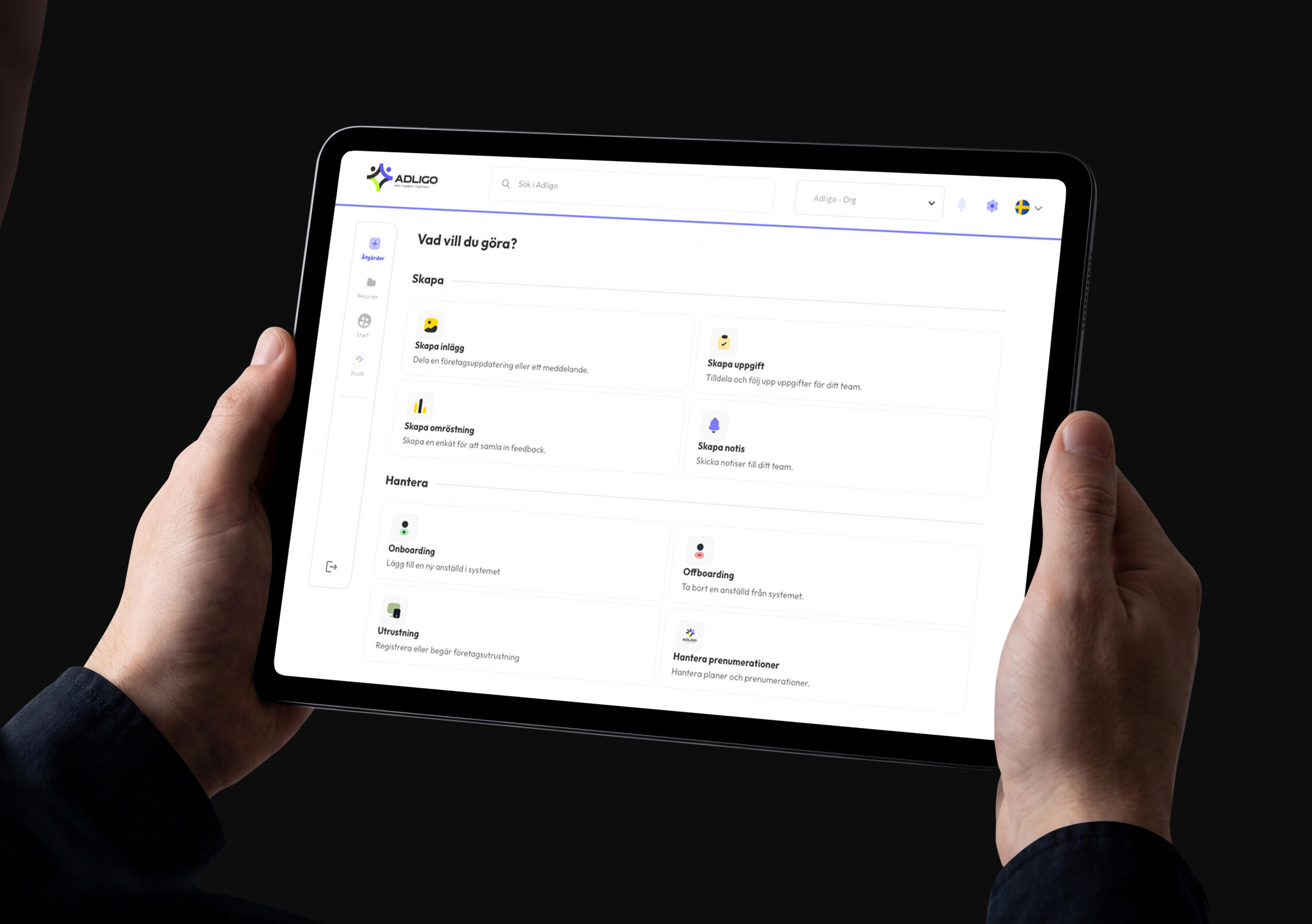
NK Spirit
A digital workplace connecting 1,600+ employees across mobile and web.
Jernhusen
Making internal communication accessible across apps, web and depot displays.

© 2026
Rethinking a management platform from brand to product.
ADLIGO is a cloud-based management platform for organisations, companies and teams, bringing communication, administration, files and everyday workflows into one connected environment.
| Role | Platforms | Focus |
|---|---|---|
| UI/UX Designer · Visual Designer | Responsive Web | Product Design · UI/UX · Brand Identity |
The challenge
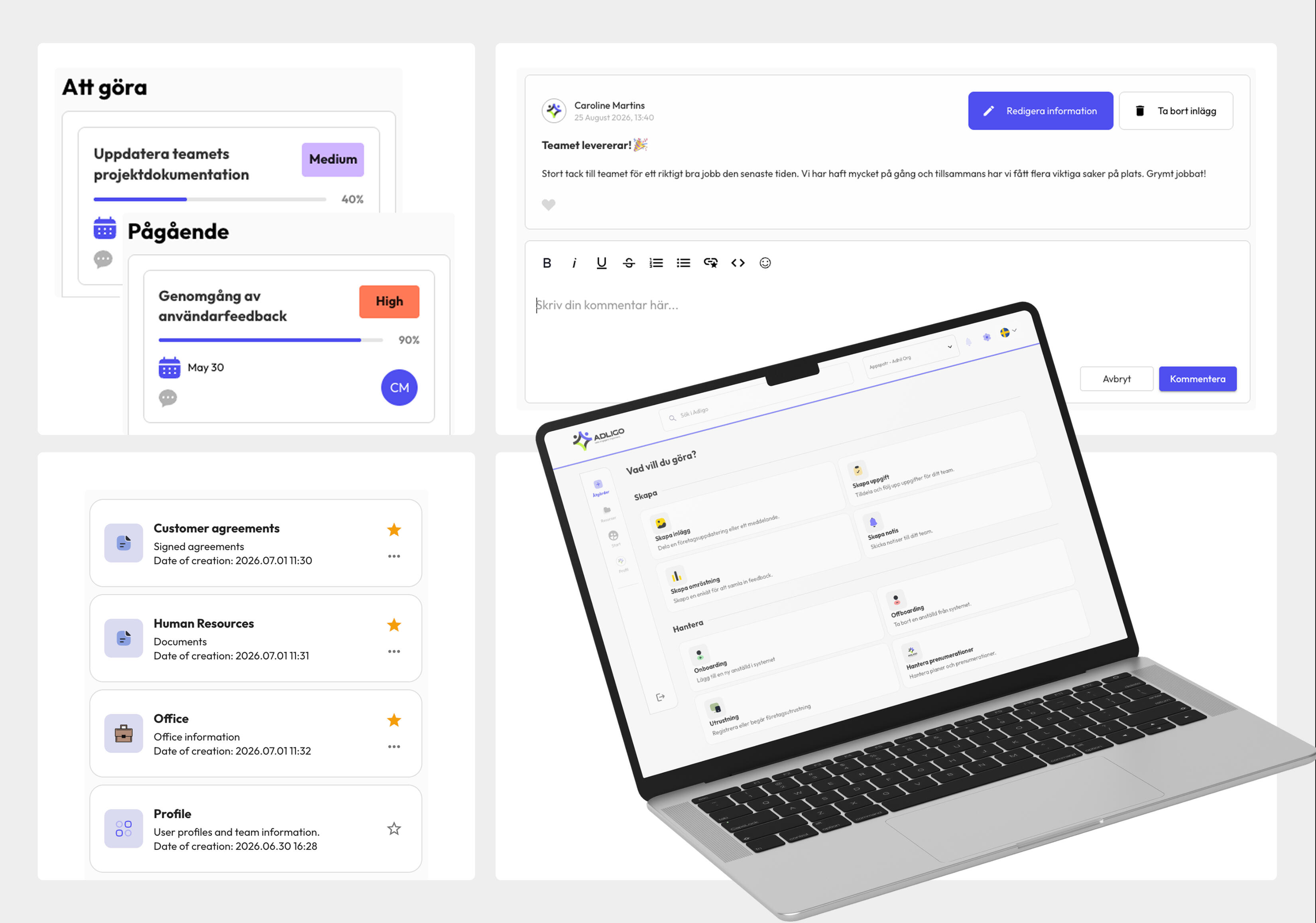
ADLIGO's existing CRM had become difficult to navigate and visually outdated. Its three-part layout created a crowded experience and wasn't optimised for the way the platform was being used.As the product continued to grow, it needed a clearer structure that could support both existing workflows and new functionality — alongside a visual identity that better reflected the product today.
My role
My work spans both ADLIGO's product and visual identity — from modernising the brand to redesigning the CRM and shaping new product functionality.This includes communication and document sharing, member onboarding, equipment management, and a new cloud-based file system designed from the ground up.An evolving component library supports the product as it grows, keeping new features and interactions consistent across the platform.
Solution
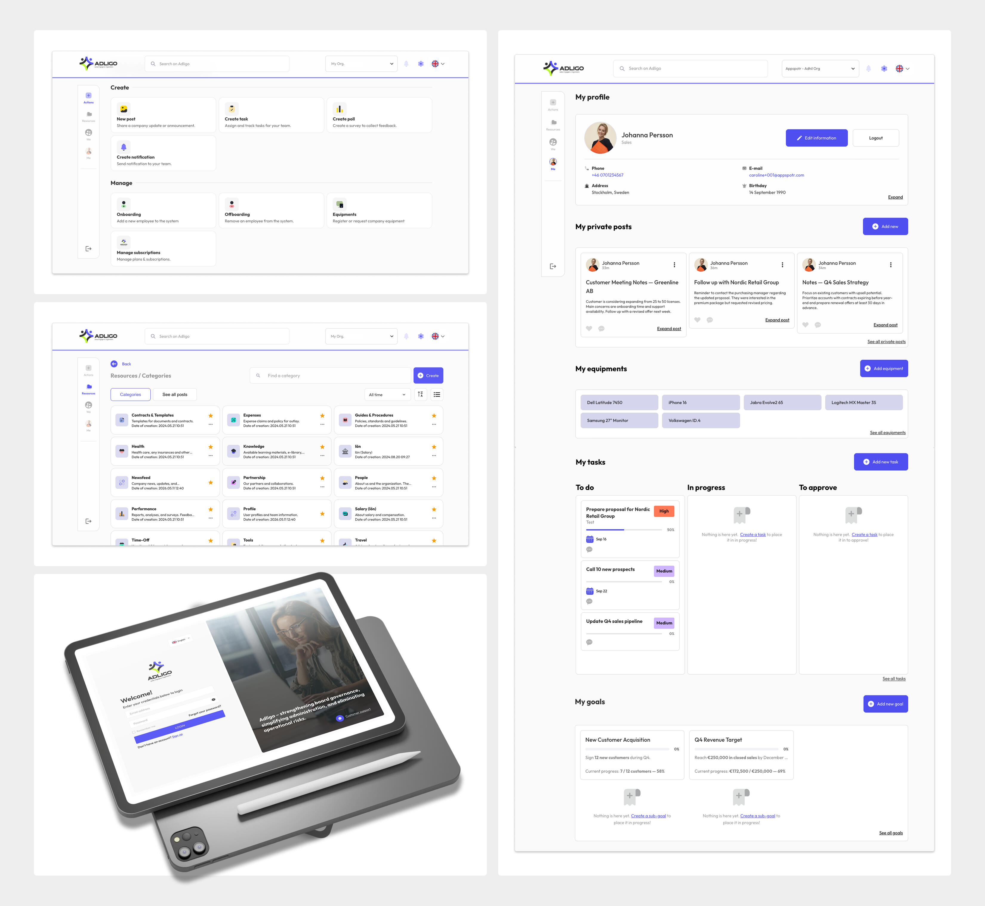
The CRM was restructured from a three-part layout into a two-part structure, creating more space for content and establishing a clearer hierarchy.The redesigned experience brings together communication, document sharing, member onboarding and equipment management, with quick access to frequently used actions. Alongside the CRM redesign, I designed a new cloud-based file system from the ground up, giving users a way to organise and share documents directly within ADLIGO.
Designing for consistency
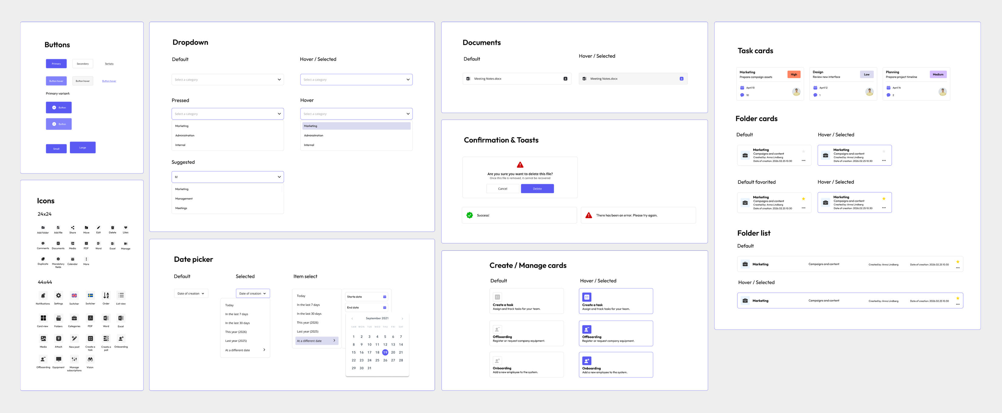
The component library provides a shared foundation for the interface and is maintained as new features and functionality are introduced.
Evolving the identity
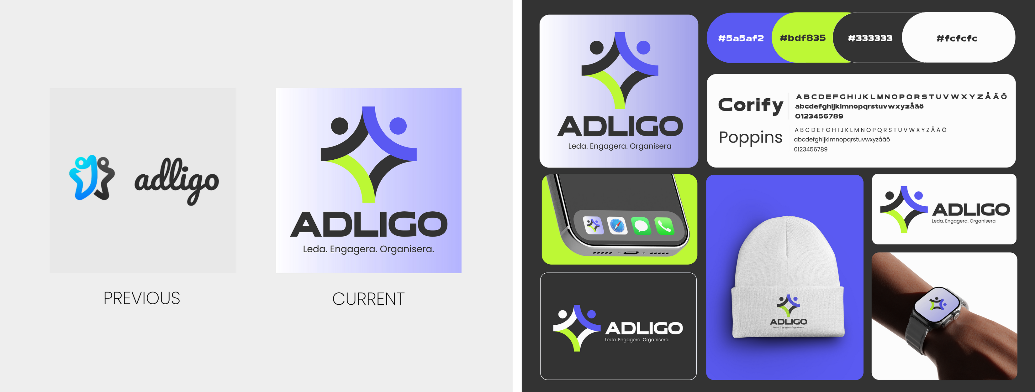
Alongside the product work, the original logo was modernised while retaining a connection to ADLIGO's existing identity.
Outcome
The redesign has created a clearer and more cohesive foundation across both brand and product.A simplified CRM improves the core experience, while the new file management system expands what users can accomplish within the platform. Together with the updated identity and evolving component library, the work provides a more consistent and scalable foundation as ADLIGO continues to grow.
One digital workplace, built for the people behind NK.
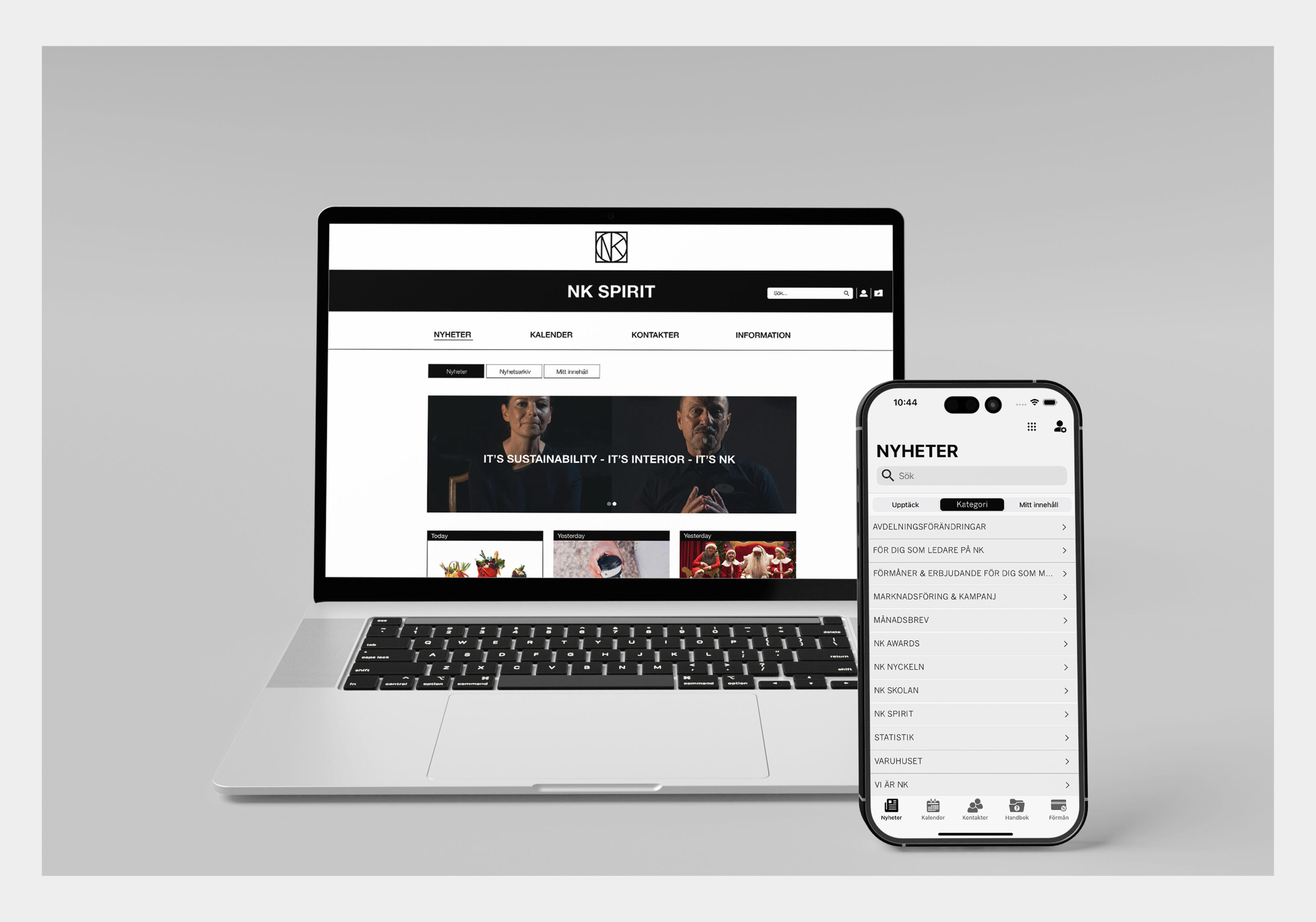
NK Spirit is an internal communication platform for Nordiska Kompaniet (NK), bringing company news, updates and employee communication into one shared experience across mobile and web.
Designed across native iOS and Android apps, responsive web and a web-based CMS, the platform needed to serve employees across different roles, departments and locations — while still feeling simple, relevant and unmistakably consistent.
| Role | Platforms | Focus |
|---|---|---|
| UI/UX Designer & Developer Coordination | iOS · Android · Responsive Web · CMS | Product Design · UI/UX · Interaction Design · Design Systems |
The challenge
With 1,600+ employees across different roles, departments and locations, internal communication couldn't be one-size-fits-all.The challenge was to create a central platform where employees could easily access relevant news and updates, while allowing communication to be tailored based on role and location.At the same time, the experience needed to feel consistent across iOS, Android and web.
My role
My role covered the experience across mobile and web, from user flows and interaction design through to polished UI, prototyping and developer handoff.A key focus was creating reusable components and interaction patterns that could scale across platforms, while close collaboration with developers helped maintain consistency between the designs and final product.
Solution
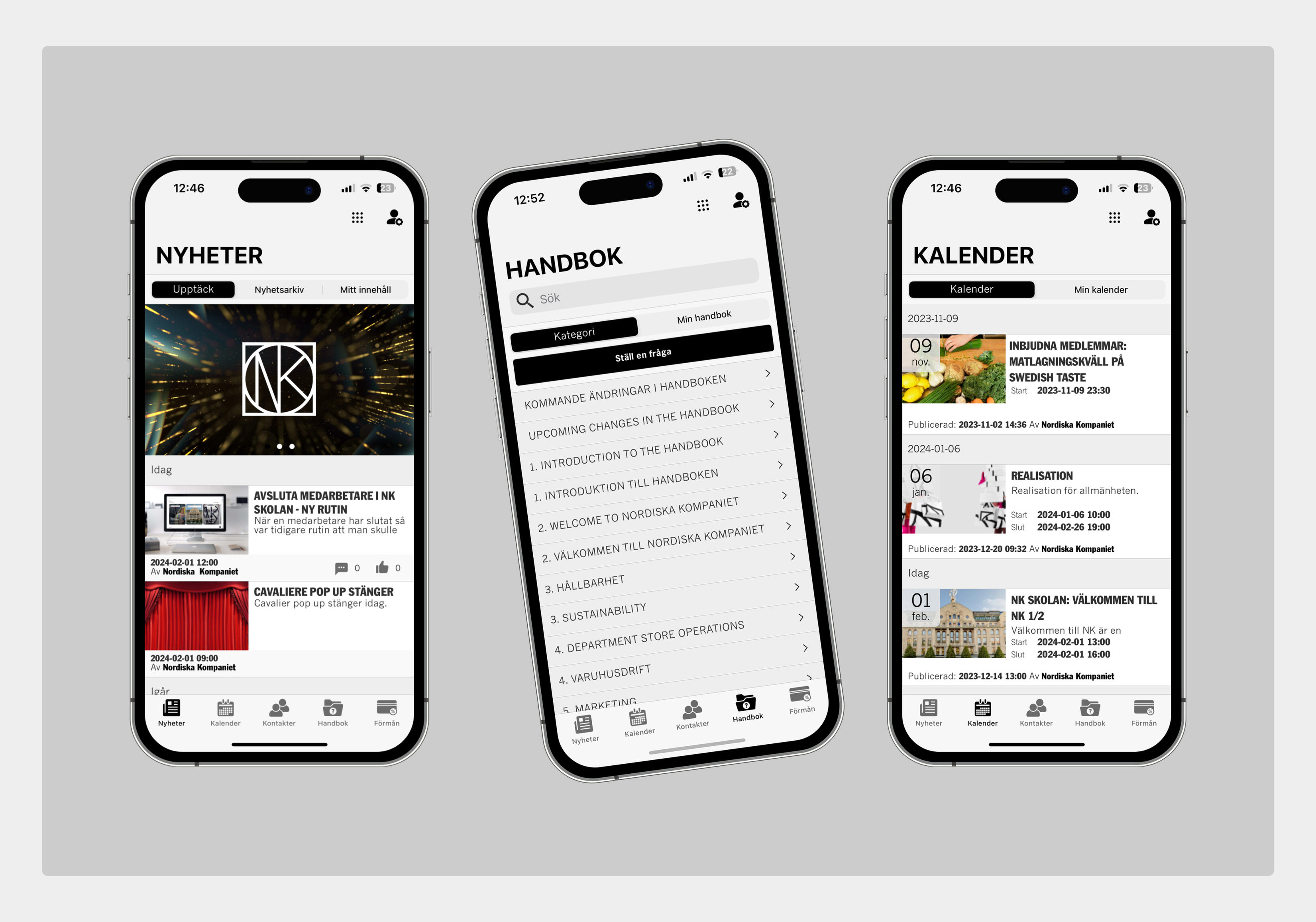
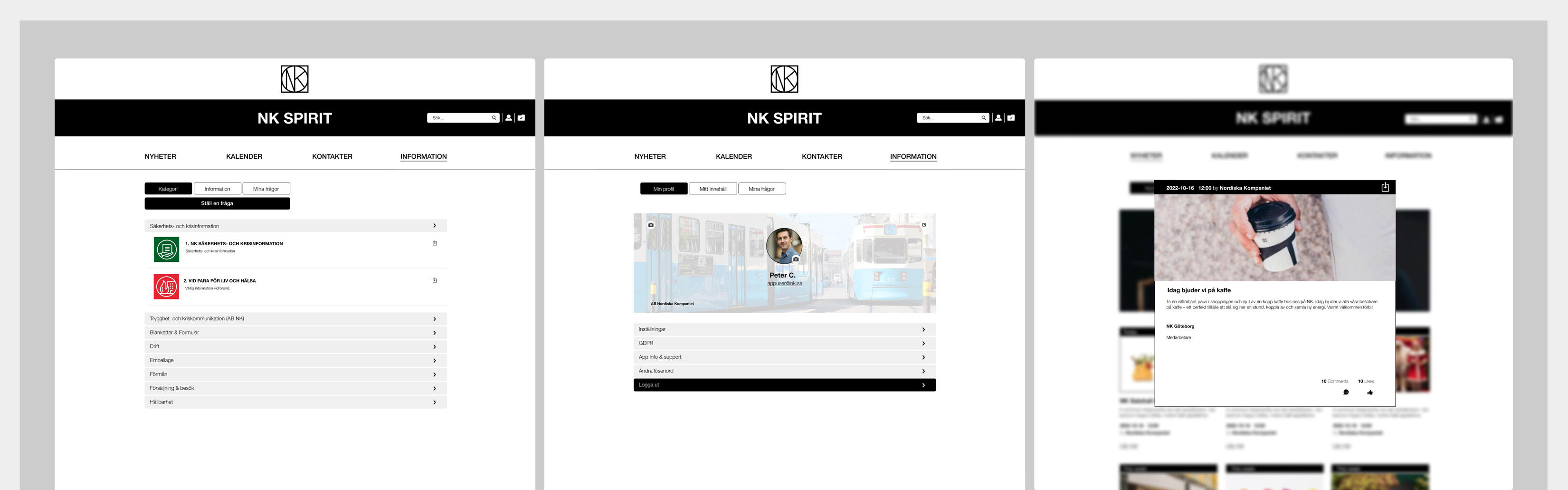
NK Spirit brought internal communication into one shared experience, with personalised content based on employee roles and locations.Clear information hierarchy, straightforward navigation and consistent interaction patterns helped shape the experience across platforms. A reusable design system provided a cohesive foundation across iOS, Android and web while supporting the product as it evolved.
Outcome
NK Spirit was delivered as a centralised communication platform supporting an employee network of 1,600+ people across NK.The final product created a consistent experience across mobile and web while giving NK a more structured way to distribute relevant internal communication across roles and locations.1,600+ employees · iOS · Android · Web
Bringing important information into view.
Jernhusen needed a modern internal communication experience that could support employees across different locations and working environments — from personal devices to shared displays at Depå.
| Role | Platforms | Focus |
|---|---|---|
| UI/UX Designer | iOS · Android · Web · Shared Displays | UI/UX · Interaction Design · User Testing · Content Structure |
Challenge
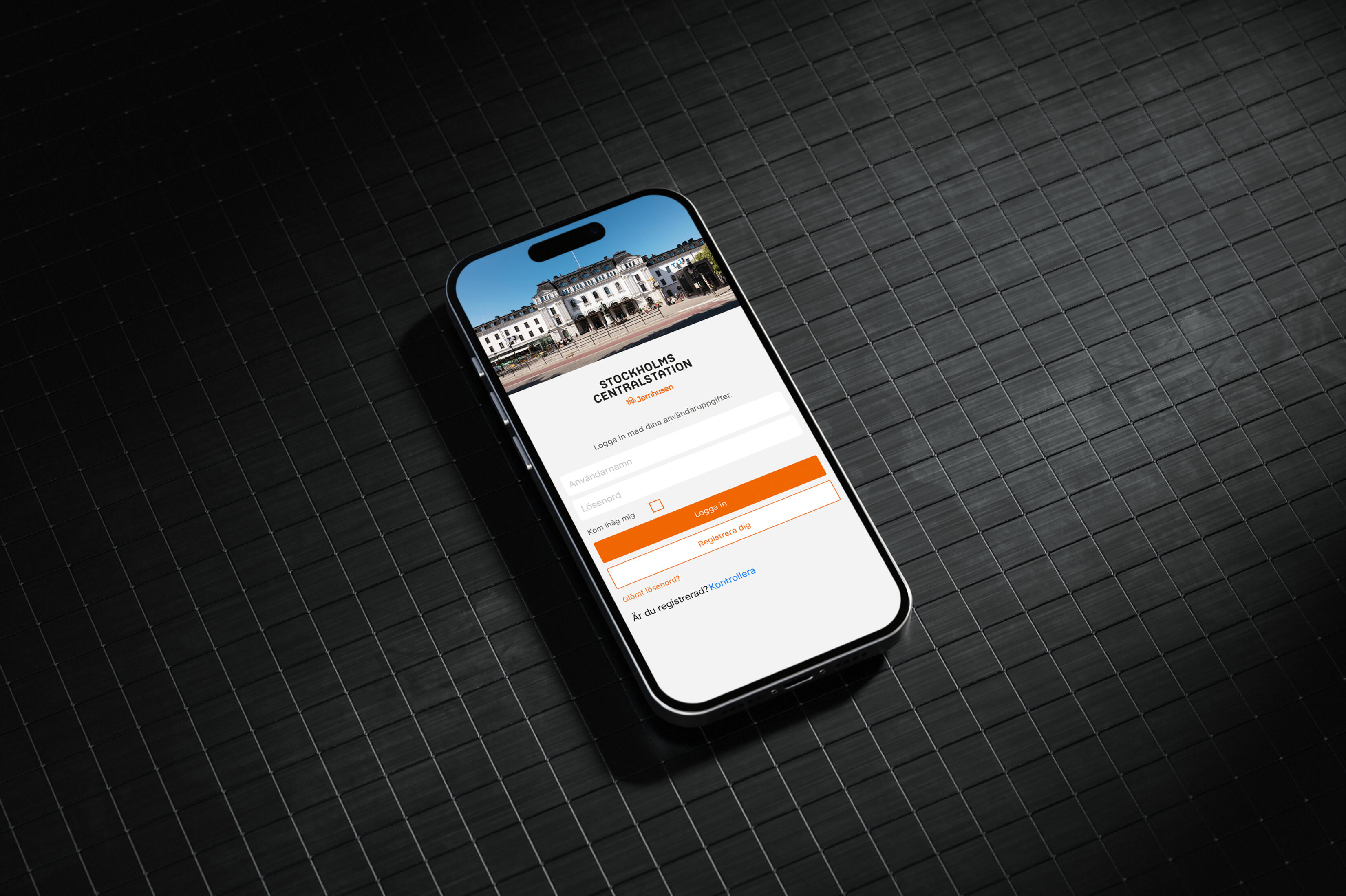
Jernhusen needed a better way to keep employees across different locations informed and up to date. Important news, announcements and operational information needed to be easy to access and relevant to the people receiving it.At Depå, communication also had to work beyond personal devices, reaching employees through shared displays in the physical workplace.
My role
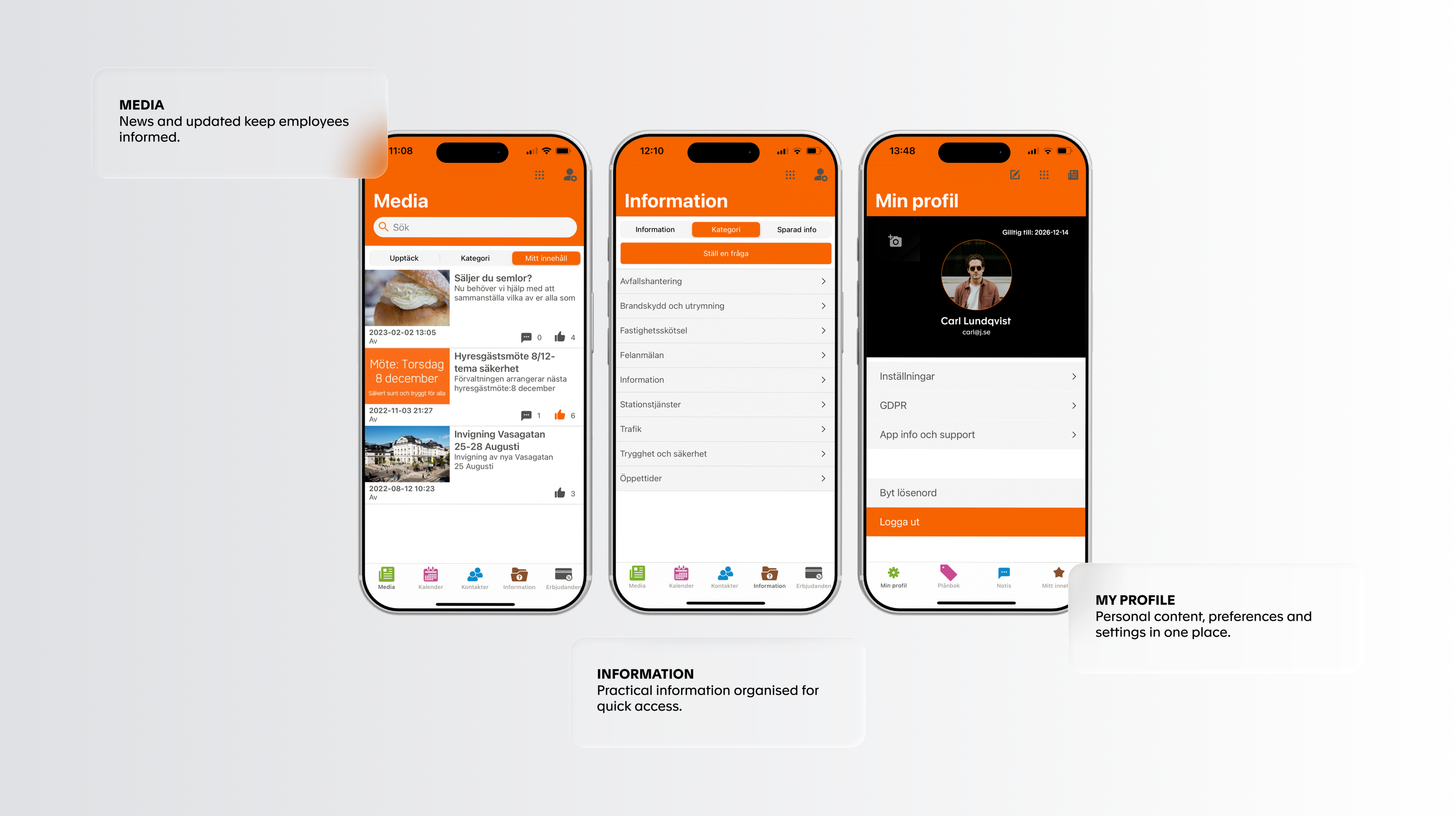
My role covered the experience across the regional apps and Depå, including user flows, content structure, prototyping, user testing and final UI.The work also included designing different interaction contexts within the app, from organisation-wide information to personal areas where users could manage their own content and settings.
Solution
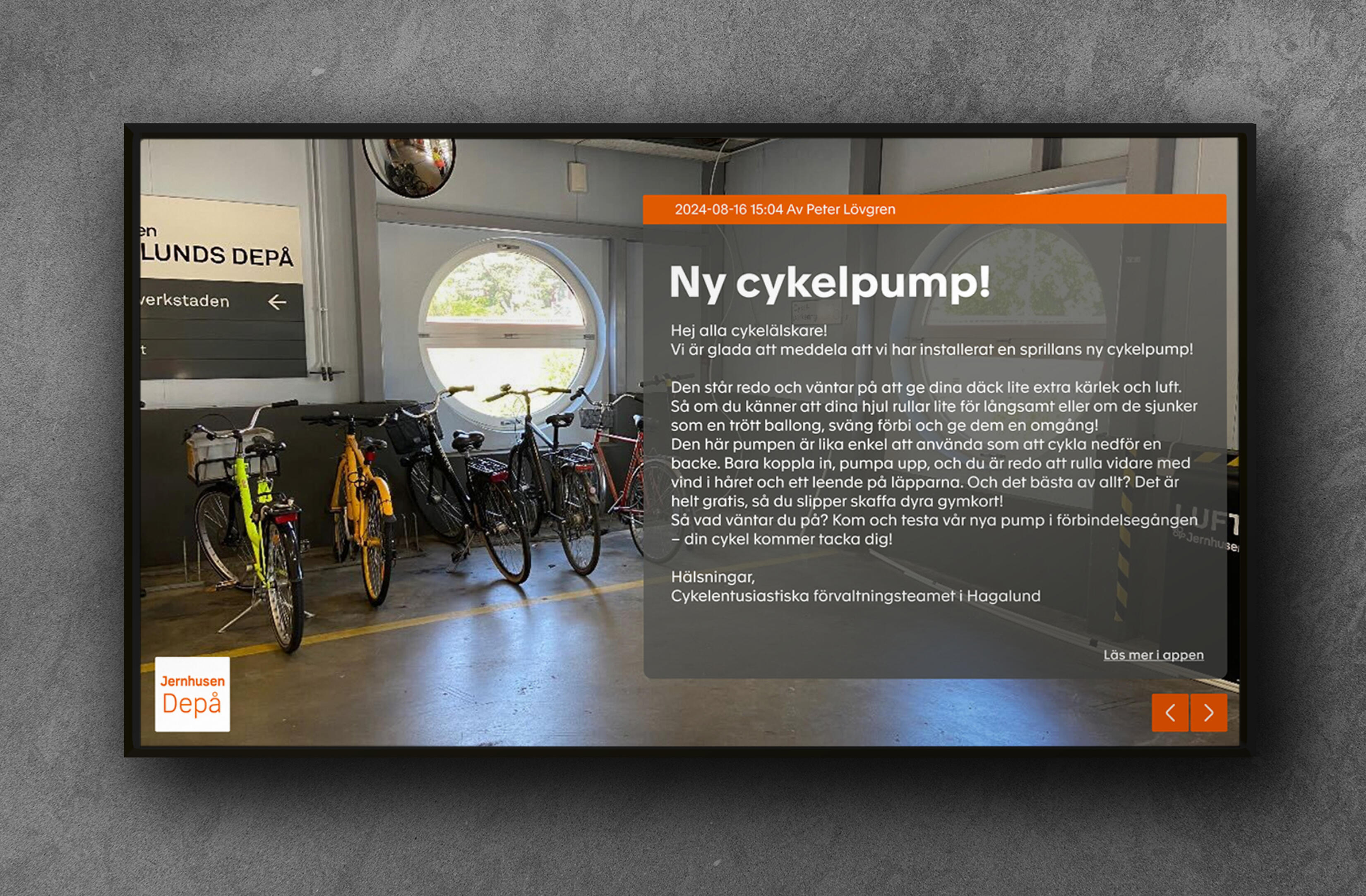
A shared communication concept was adapted across regional versions for Stockholm, Göteborg and Malmö, alongside the Depå experience.The apps brought news, updates and practical information into one place, helping employees stay informed while also providing access to personal content and settings.At Depå, selected communication could also be managed through the CMS and surfaced on shared displays. The display interface prioritised hierarchy, readability and information that could be understood at a glance.
Outcome
The result was a communication experience that could adapt across locations and contexts — from information accessed individually through the app to selected updates displayed within the physical Depå environment.iOS · Android · Web · Shared Displays